Showing posts with label Powerpoint. Show all posts

Wednesday, April 24, 2019

Melissa Marshall: Talk Nerdy to Me

Several months ago, we had the privilege of attending a workshop ran by Melissa Marshall. She was previously involved in technical communication research at Penn State University but now works as a consultant to help scientists better deliver presentations.

While we may not be traditional scientists, her insights can readily be applied to the science of sabha. She mirrored many of the insights we have expressed since this blog's inception. Here's two concepts she addressed worth considering before the next karyakar meeting.

Problem: We start preparing presentations using Powerpoint.
She compared giving a presentation to guiding individuals up a mountain. As a trail guide, it's our job to identify the salient landmarks en route to the peak. Stopping at every grass, shrub, and rock drains our audience before they reach the peak. Similarly, we waste the audience's attention when we start with slides and lose sight of what's important by cramming details, slide after slide. 

Solution: Start with idea mapping.
  • Start with identifying the peak (main idea). (Unsurprisingly, Made to Stick was listed on her references list.)
  • Identify 2-4 points that can help you build up to the main idea. 
  • Determine the details that should fit underneath each point.
  • Review your outline with someone else to make sure your ideas flow. 
  • Now, proceed to Powerpoint.

Problem: Bulleted lists pervade slides.
She points out in her TED Talk, "Have you ever wondered why they're called bullet points? What do bullets do? Bullets kill, and they will kill your presentation."

In an average talk with text-heavy slides, most individuals filter information in one of three ways.
  • Read slides but ignore speaker 
  • Listen to speaker but ignore slides 
  • Tennis between speaker and slides 

Solution:  People learn much more deeply from words and relevant images than from words alone. 

  • Complement bullet points with graphics. (Here's an example).
  • The Noun Project offers many free icons to use for presentations.

Agree or disagree, please let us know how insightful you found these points.


Wednesday, January 29, 2014

Brussel Sprouts and PowerPoint

Brussel Sprouts have a bad reputation. Many people don't like them, because the primary way of cooking them in the past was to boil them, and when you boil brussel sprouts it is not very pretty. There has been a renaissance in sprouts as of late as people starting roasting them with a bit of olive oil and salt. They taste (and smell) infinitely better this way. The problem was not the sprouts - it was how we used the spouts.

Powerpoint is in the same boat as brussel sprouts. Most of us have sat through egregious powerpoint presentations. Edward Tufte has railed against them and Saba.ology has touched on this subject. However powerpoint is a tool. It is not powerpoint that makes bad presentation, it is people that make bad presentations. John Foreman, on his blog, gives an excellent analysis of this, as well as the biases that informs Tufte's stand.

Having been a consultant to the federal government for a number of years, it was hard to not hear about Edward Tufte. The style of communication used by government consultants and their clients (particularly the military) are anathema to the longtime information design,data viz luminary. So when I was at Booz Allen, my team used to think about his perspective as a counterpoint to how we built data visualization products.
Today, I had the privilege of attending one of Tufte’s training sessions in person. I along with a few hundred other folks gathered in a hotel ballroom for a 6 hour tour of his many books and theories. 
He’s got awesome points. Let me summarize some that will be pertinent to this blog post:
1) Humans have a good vision system. So we shouldn’t hide data (especially related data) behind hierarchical layers. Rather, data should all be displayed on a single canvas where readers can delve into it and digest it with speed. If data points are related, then that relationship can be called out by allowing the data to share space. To emphasize these points he contrasted the National Weather Service’s  local forecast website with most corporate websites (using an XKCD comic to underline his point). 
Picture
The NWS uses simple, intuitive dumps of data, and they plop it all on one page, whereas many websites would hide this amount of info behind layers and layers that “disrupt the signal.” As Tufte puts it in one of his books:  
“Visual reasoning usually works more effectively when the relevant evidence is shown adjacent in space within our eyespan.” 
In order words, it’s the author’s job to serve up the data on a broad platter, and it’s the reader’s job to chop it up and make sense of it. Data should not be served precut in bitesize chunks a la Chinese food.  For what it's worth, I think the NWS website is ugly as balls, but that’s neither here nor there for this post.
2) The audience of a presentation should be given data and reading upfront (Tufte loves paper) and allowed to digest data at their speed.  As he puts it in his book Beautiful Evidence:
“It is helpful to provide audience members with at least one mode of information that allows them to control the order and pace of learning – unlike slides and unlike talk.” 
3) Visual adornment for the sake of visual adornment in data presentations should be avoided. He calls this “chart junk.” Amen! Here’s a great animation that drives this point home. 
Those were the three well-reasoned takeaways for me. But he had a forth point he kept hitting over and over...
PowerPoint is Evil
When I say that Tufte thinks PowerPoint is evil, I’m not making a joke. Tufte  argues that visual communication is a “moral and ethical” undertaking for the presenter. To chop up information between slides, force readers to drill down, hide relationships by separating them on disparate slides,  slow down information transfer by minimizing words on a slide (low information density and throughput) is to communicate dishonestly. 
The use of PowerPoint to split apart data and ideas and deliver them piecemeal to an audience is an amoral power play. I disagree. 
Brussel Sprouts & Why Slides Don't Kill People, People Kill People
Brussel sprouts have had for a very long time a bad reputation. On after school cartoons (Rugrats comes to mind), they always ranked up there with liver as dreaded food items. Why? Because if you boil them, they’re foul. And for years and years, that’s how they were prepared in the U.S. But these days, brussel sprouts are making a comeback. Every new restaurant I go to from hipster speakeasies to lawyerly steakhouses is putting them back on the menu. What changed? The preparation. They’re not boiled any more. They’re often split and roasted with olive oil  and served with salt, lemon, goat cheese, pine nuts, parmesan, etc. It's delicious. Brussel sprouts were never the problem. People were the problem. They were preparing them wrong. 
PowerPoint is the same.  
About halfway through Tufte’s presentation, I noticed that much of his time was spent flipping through slides. He showed a slide of this beautiful graphic beautiful graphic from the New York Times and then he flipped to a slide of Tim Berners-Lee’s proposalfor creating the internet and so on. His slides were single, information-dense graphics. Nothing that couldn’t go on a PowerPoint slide.  So really his problem isn’t with PowerPoint then is it? It’s with how the enterprise uses PowerPoint. What he’s really criticizing is not PowerPoint as a tool, but rather the default use of PowerPoint by an old guard. When I create a new PowerPoint deck, the first thing I do is delete the title and text box of the default sheet and start with a blank slate. Then I build up slides not much different from those I saw Tufte present.  
“But wait!” you might say, “The fact that the default slide in PowerPoint has a bulleted list PROVES that it’s intended for evil!” The default preparation instructions on the side of my bag of store-prepped and washed brussel sprouts are to boil them. Does that make sprouts inherently evil? Nah. Just ignore it and use the tool/vegetable how you wish. 
What’s wrong with POWER?
In Beautiful Evidence, Tufte calls PowerPoint “pushy” and “tends to set up a dominance relationship between speaker and audience, as the speaker makes power points with hierarchical bullets to passive followers.”  I heard a lot of language like this today. PowerPoint in its default use was equated to no less than the figurehead of hegemony himself – Dick Cheney.  
Hey, I get it. I’m all for active listening, especially in film and television. That’s why I’m such a huge fan of reference-based rapid-fire dramadies like Gilmore Girls and Veronica Mars. They make the reader work and pay attention in ways that inane laugh track garbage can't. 
But let's follow some other bits of Tufte's logic and see where we end up. One thing that Tufte kept saying was “if you want to play with the big boys,” you’ll get rid of PowerPoint. And his biggest boy of all was Apple. Tufte loves him some Apple products. He feels that the iPad in using a touch screen (doing away with interface elements such as pointers and scroll bars) has freed up more visual space for data. Good point. That’s awesome. Tufte pointed out that, naturally, Apple does not use PowerPoint in their meetings. Indeed, Steve Jobs dropped the f-bomb four times in one sentence when discussing PowerPoint with him. Go Steve! 
But wait.  
How can Tufte align himself with Steve Jobs? Jobs is the antithesis of open-canvas, all-on-one-slide, read-ahead data communication. While Tufte criticizes PowerPoint presentations as “aggressive” and “over-managed,” there is no more over-managed presentation than a Jobs presentation. Don't believe me? Read here. 
There’s even a word for Jobs' highly controlled, authoritarian presentation style: the  Stevenote.
And the hallmark of the Stevenote was “one more thing.” 
The act of declaring “one more thing” at the end of a presentation is inherently opposed to Tufte. It’s all about keeping information back, not laying it on a canvas, not putting it in front of the audience. The relationship is not one of "respectful teacher and student" but one of king and awestruck subject. But if Jobs’ method of presenting is so reprehensible, as I'd hope Tufte would admit, then why is he lauded as one of the most effective presenters of all time?
We Present to Convince
For Tufte, the objective of a presentation is maximum data throughput. The speedy, digestible transmission of data to the audience. Hierarchy and layers just get in the way of a data buffet.
But for Jobs and indeed for many presenters, this is a secondary concern.  The primary concern is to make an argument. (A sales pitch is an argument). Tufte is an academic. He said over and over again that the best examples of his philosophy can be seen in scientific and mathematical literature. In these contexts, data speaks for itself. 
But in Jobs’ context, an argument is made not by vomiting data before the audience but by teasing it out in just the right way. Save the best for last. This is no different than a comedian timing punch lines perfectly. A comedian would never give you the jokes on a “high density paper read-ahead.” That’d spoil the presentation! 
Wrapping This Up
So those are my two main reasons for why Tufte is wrong about PowerPoint:
  • He uses the enterprise's typical use of PowerPoint as a straw man for PowerPoint itself
  • Not all presentations are given for the sole purpose of transmitting raw data. And when this is not the case, the style of information delivery can affect the outcome of the meeting.
That said, Tufte seemed to like Excel. Which we all know I freaking love. So I’m still a fan. Now on to make some PowerPoint slides for my talk in Arkansas next week.

Wednesday, December 7, 2011

Designing Slides

Corso Presentazioni EfficaciBullets, borders, boxes: the three B's of slide design. Throw in one more: boring!

A fellow Sabhaologist sent in this article by Zach Holman that highlights a few principles to accentuate our presentation. His slides wowed the audience so much that after his talk, his slides got voted #1 on Hacker News. 

Zach notes, "Working on your slide design pays off for the audience in front of you and for the audience online reading your slides later. I learned a lot designing this talk, and I think it can be helpful for you, too."
  • Color: "Color is the very first thing people will notice. It should also be the very first thing you think about." Use lighter shades to accentuate darker shades (e.g. light blue & dark blue).
  • Size: Zach's slide deck averages 150pt with 300pt or more on the high end or 90pt on the low end. Go big or go home.
  • Words: "Letters themselves can be part of the design." Thus, Zach's slides will shake up the size from slide to slide to emphasize different elements - an application of unexpectedness.
  • Repetition: "The best storytellers will repeat the same line throughout a story to build a sense of familiarity, of excitement...Steve Jobs did this often. Before moving onto the next product announcement, he’d spend thirty seconds and go over the same information he just presented. It’s a very simple way of keeping things memorable for your audience." Zach starts each section with colorful, bold text on bright, orange backgrounds.
With Powerpoint's assortment of templates, designing slides seems like such a waste of time, yet if the audience finds our slides a waste of their time, our message is lost.

Maximize their time by creating slides with craft and care.

Tuesday, October 11, 2011

BST ppt not for Me?

In the past we have examined the pitfalls of powerpoint. (this applies to keynote and prezi as well). Putting these suggestions to practice is many times much easier than we might think. We are fortunate to have a starting point many times with the ideas already in the presentation. The ideas are the hard part. Sprucing up the presentation is usually much easier. The following is from a packet on presentation skills - something we have been thinking about for awhile. The first PPT was great, because the ideas were great. With a half hour of tweaks we wound up with this second version. Small things make perfection but perfection is no small thing.

Version 1

View more presentations from Sabhaology

Wednesday, May 18, 2011

Jim & His Presentations

When we think presentations, we think PowerPoint. It's a fact that has been drilled in our heads since the beginning of time (or at least from when we first started presenting at mandir), yet PowerPoint can often make our presentations suffer if used incorrectly.

That's the lesson Jim learns along with some other tidbits:
  • Brainstorming is best done low-tech. That's right, PowerPoint is not a requirement for crafting simple statements, shakeups, and stories, but some mental energy is.
  • Each slide is best utilized to explain ONE point. After all, they're free!
  • Clip art is best used to explain the point at hand - not just to fill empty space.
Learn all this and more through Jim's story below.

Wednesday, February 23, 2011

Wednesday, December 15, 2010

You are the presentation

A presentation - be it for work, mandir, or school - is a reflection of yourself. The following slide deck earned second place at 2010 SlideShare competition. There several interesting ideas and helpful hints. A few thoughts that captured our attention:
  • If your presentation sucks (their words not ours) so do you.
  • To make a great one hour presentation takes thirty hours of prep.
  • Getting rid of a header or logo from every page. This made sense to us, the first splash page is fine, but the rest of the slides the logo simply takes valuable real estate without adding any more information.


Thursday, October 21, 2010

How NOT to use PowerPoint

A very funny take on some ideas we have discussed in the past. Maybe helpful for review packages, training seminars, or conventions.

Life After Death PowerPoint from EMT Media on Vimeo.

Friday, February 26, 2010

Dead Bulbs go PIP!


The previous few posts reminded me of a time when everyone in grad school had to give presentations. This was in the day of overhead projectors (instead of DLP projectors and powerpoint slides). The talks were a mix of sticky, wacky, tacky, and sleepy. The talks however carried a great deal of weight. It was like the football combines for grad school - you impress here you get a sweet research fellowship, internship, job - basically you are not a starving grad student anymore.

The one talk that impressed many in the room was a guy who was giving an abstruse talk on gallium arsenide for better transistors. He was not totally unsticky, but he did suffer from the curse of knowledge. He assumed everyone knew everything he knew about the subject, even though he had been researching this for about four years. I was lost at slide 3, as bored grad students we took and average and found that most people (at least in the back three rows) were lost at about slide 2.7.

However the most impressive part of this talk was that in the middle of the talk the bulb in the overhead projector pops with a pretty loud BIP (that is technically the sound an overhead bulb makes when it stops working). This made the talk extremely interesting for the back three rows because:
  1. We commiserated with the guy, this was really bad luck, and it could've happen to any one of us.
  2. We could follow his talk know because it was not about gallium arsenide but about bulbs.
  3. That BIP noise really woke us up and we noticed that people were looking around - especially at the back three rows.
The guy giving the talk did not miss a beat. He never stopped talking about his topic (time limits were enforced). He opened his back pack and pulled out an extra bulb. He opened up the overhead (you could tell by the ease in which he did this it was not his first time) replaced the bulb and kept right on going - skipping two slides which he mentioned he covered while replacing the bulb. He got several sweet job offers.

Not to be outdone I have seen karyakars at shibirs, meetings, and conventions come with their own portable speakers, laptops, and even big pads to stick on wall just as a backup. If things do not work out, they simply go to plan B. They probably have sweet jobs as well.

Perfect your Presentation - Get rid of slides randomly?


[This is another guest post by a reader who as been there from the very beginning - about two months ago. You too can send a guest post hit up the comment links below.]

This fits in with the post about Gladwell writing out his entire talk and then memorizing. He basically practices a lot before speaking. The following tip came from LifeHacker and was written by Alex Croft. His overall idea is that if you know your talk well then if something goes wrong you can still make the talk stick. His intuition is to practice this by having someone remove a random slide (or note card) form your presentation - can you still get through it without going through the Uhhh ohh Umm - or giving the AV guys the Neck Crane? (Seriously if you don't now what the Neck Crane is you need to click on that previous link). We have all been there where the video will not play on the powerpoint, or that codec which you tested a hundred times before the talk will not work, or the mic go off - but if you practice it ahead of time you can make it stick.

I was at a microbiology seminar this afternoon where a researcher was giving a presentation via PowerPoint. After a few slides a crucial diagram failed to show up over the projector. I would have gotten flustered and cursed the Microsoft Office for Mac gods. This presenter didn't though. She just walked over to a nearby whiteboard and drew out the entire diagram from start to finish, explaining as she went along. This turned out to be a much more effective way to describe her system than even a perfectly constructed PowerPoint slide ever could. Even more effective? Everyone was impressed how well this presenter knew her stuff—it was a very complex diagram.

It's one thing to follow something already on a PowerPoint slide. It's another to recall it completely from memory under pressure and technical malfunction.

This got me thinking. A spectacular way to practice a PowerPoint presentation would be to have someone eliminate one of your slides, or a section of a slide. Then, run through that altered presentation and see if you can compensate for the missing material. This will make you feel more confident about your presentation, and help you avoid being flustered if everything doesn't run smoothly. You know you can never trust a PowerPoint.

We all know that practice makes perfect, but this method takes it one step further—being able to practice your presentation with slides is one thing, but knowing the material so well that you don't even need the slides really shows your stuff (and, if you do have problems, it shows that you know how to keep cool under pressure as well). Got any other tips for perfect presentations? Share them in the comments.

Wednesday, January 13, 2010

Animal Instincts

The following is a great school day talk (similar to commencement talk). The ties to satsang are pretty evident - controlling vishays. If we do not we are just like any other animal. Interestingly Dr. Sapolsky shows how we are in many ways similar to any other mammal, we just take things to an extreme. You may also notice that he does not really follow the no bullets power point guidelines espoused by many who believe in sticky presentations. I think his power point really detracts from this talk, however he makes up for this with his very strong storytelling. The lesson here is that in the Made To Stick hierarchy being strong in one aspect can overcome being weak in another.

This talk is really interesting, but quite long. It may not be suitable for a sabha talk or even an introduction to a goshti. You can always show a clip or cut and paste an abridged version. We have found showing clips can sometimes be a distraction - you have to get the video setup, pause hit play - all for 30 second clip. Another idea would be to simply restate his stories in your own words. Just by citing his work, you get instant Crediblity, tying it to a real world issue (which he does) gives Concreteness, and you are saying a Story that many people will find Unexpected in the context of sabha - this hits 4 out of the 6 MtS SUCCES metrics. How else do you think can this be used?

Friday, January 8, 2010

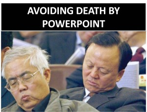
Tickled by Life: Avoiding Death by PowerPoint!

Shalu Wasu's article tackles the age-old issue of sprucing up Powerpoint.

Here's a snippet - how do the great model their Powerpoints? As we can see, the styles vary dramatically.
  • Lawrence Lessig: He is a monster slider! He can use up to 200 slides for a 10 minute presentation and he makes them really good.
  • Seth Godin: He follows a style which has a lot of visuals, little text and likes to surprise the audience.
  • Guy Kawasaki: 10 slides, 10 ideas, one idea per slide, not more than 20 minutes.
  • Takahashi: Super size font sizes (more than 120) and obviously very little text
The last point?
Do not stick to your story. Make the story sticky. Try to follow at least 4 out of the 6 essentials that Chip and Dan Heath talk about in their book Made to Stick. Here is a quick summary.
Made to Stick strikes again!

BNET Team Taskmaster: Please, No More Death by PowerPoint! (9/15/09)

A common presentation tactic is to use the handy dandy Powerpoint. Who can beat those seamless slide transitions with words and pictures flying onto our slides?

To juice up our presentations, take a look at this post by CC Holland.
Oh, you want me to join your meeting for a quick info download? Great. Don’t forget to tell me to build a PowerPoint presentation.
Instead of letting me speak to the group for three minutes to explain the new initiative, make me present a slide deck. With bullet points. And, preferably, with cutesy little graphics. Bonus points for animated slides.
Make sure we take time to futz with the A/V setup, pull the blinds, and make sure everyone in the room has a good sightline. Burn a little time by making me stand up in front of the group and assigning some random person to click through my presentation for me.
By all means, have me read verbatim from the PowerPoint slides. After all, it would be heresy for me to be spontaneous, natural, or (God forbid) collaborative with my audience.
Remind me to make 14 hard copies of the slide deck to pass out at the conclusion of my talk, which has now taken 20 minutes instead of the anticipated three. Why? Because no one was paying attention to the presentation anyway, so they might want to read it later.
Also, it makes people feel important to walk away from a meeting with a sheaf of paper. Let’s not worry about the trees or the company’s “Go Green!” initiatives.
And above all, never mind that it took me a grand total of two hours — building the slide deck, making copies, and presenting — to convey information that, again, should’ve taken three minutes, max.
What a great use of my time and a fabulous way to boost my productivity! The corporate reliance on PowerPoint for all purposes is clearly a wonderful, wonderful thing.
Link:  http://blogs.bnet.com/teamwork/?p=1301&tag=col1;post-1301