 Bullets, borders, boxes: the three B's of slide design. Throw in one more: boring!
A fellow Sabhaologist sent in this article by Zach Holman that highlights a few principles to accentuate our presentation. His slides wowed the audience so much that after his talk, his slides got voted #1 on Hacker News.
Zach notes, "Working on your slide design pays off for the audience in front of you and for the audience online reading your slides later. I learned a lot designing this talk, and I think it can be helpful for you, too."
- Color: "Color is the very first thing people will notice. It should also be the very first thing you think about." Use lighter shades to accentuate darker shades (e.g. light blue & dark blue).
- Size: Zach's slide deck averages 150pt with 300pt or more on the high end or 90pt on the low end. Go big or go home.
- Words: "Letters themselves can be part of the design." Thus, Zach's slides will shake up the size from slide to slide to emphasize different elements - an application of unexpectedness.
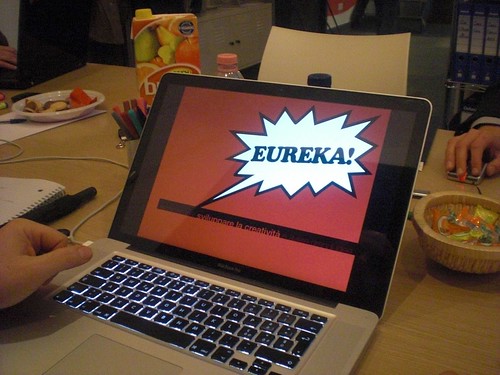
- Repetition: "The best storytellers will repeat the same line throughout a story to build a sense of familiarity, of excitement...Steve Jobs did this often. Before moving onto the next product announcement, he’d spend thirty seconds and go over the same information he just presented. It’s a very simple way of keeping things memorable for your audience." Zach starts each section with colorful, bold text on bright, orange backgrounds.
With Powerpoint's assortment of templates, designing slides seems like such a waste of time, yet if the audience finds our slides a waste of their time, our message is lost.
Maximize their time by creating slides with craft and care.
Maximize their time by creating slides with craft and care.
No comments:
Post a Comment